
Type: Product / Motion Design / Design System (Fintech)
Role: Product Designer & Motion Designer
Team: 1 PM · 1 Front-end Engineer · 1 Product Designer (myself)
Timeline: 2 months
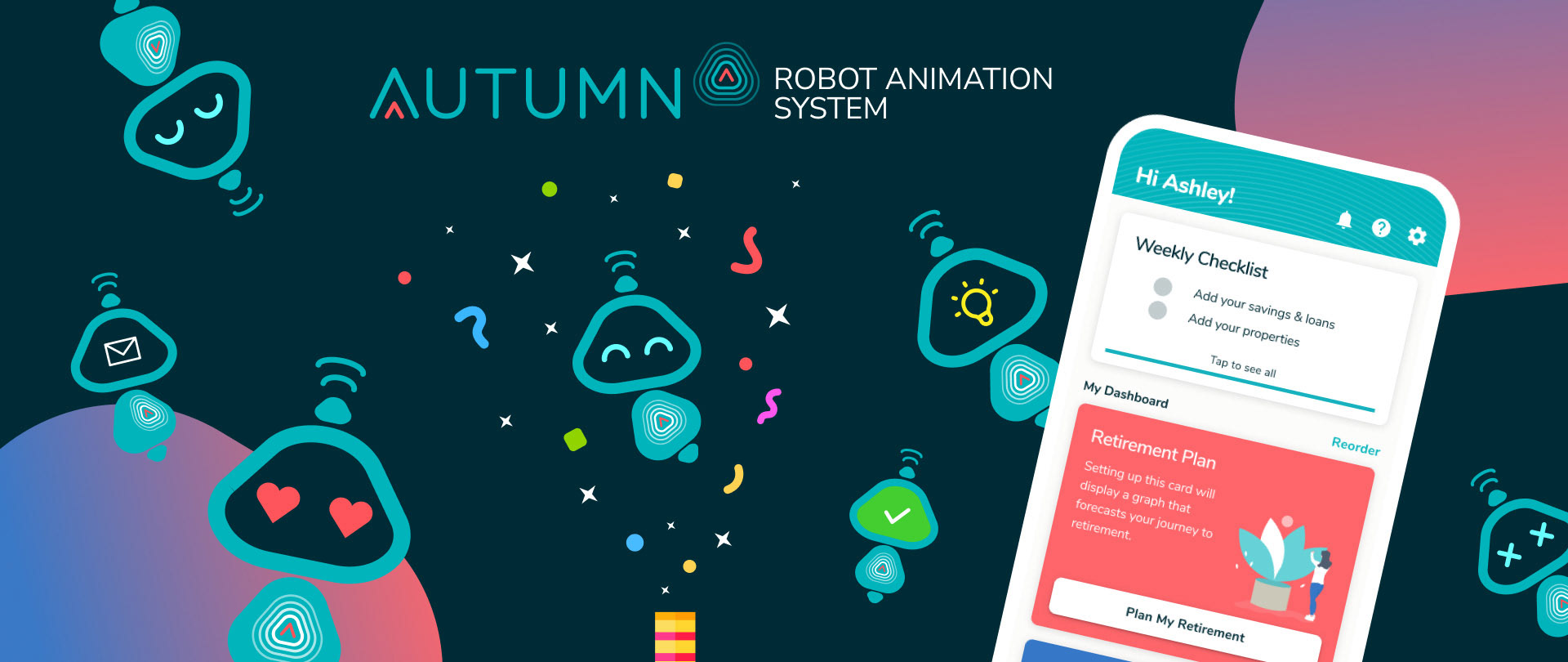
Company: Autumn (SC Ventures-backed startup)
🔍 Executive Summary
Autumn was a Singapore-based financial wellness app combining financial planning with lifestyle insights.
To strengthen its visual identity and unify the experience across product and marketing, I developed an end-to-end animation system for Autumn’s robot mascot, transforming it from a static illustration into a flexible, emotionally expressive, and reusable design component.
The result: a living brand asset used across onboarding, product tours, and campaigns, creating a consistent yet playful experience that humanized the app.
🧠 Context & Challenge
Autumn’s early app relied heavily on open-source illustrations, giving it a generic look and feel.
The design team had introduced a robot mascot, but it lacked emotional range and flexibility. Both product and marketing needed a more expressive, scalable system to tell complex financial stories in a simple, human way.
My goals were to:
1. Enhance the robot’s emotional range and versatility.
2. Build a modular animation library usable by both design and engineering.
3. Integrate the mascot seamlessly into product and marketing touchpoints.
2. Build a modular animation library usable by both design and engineering.
3. Integrate the mascot seamlessly into product and marketing touchpoints.
🔬 Research Insights
I interviewed key stakeholders, from PMs and marketers to the CEO and former designer, to understand the mascot’s role and perception.
Key findings:
1. Visual identity gap: The app's illustrations looked “templated” and impersonal.
2. Emotional disconnect: The robot was liked but felt flat and under-expressive.
3. Limited versatility: Couldn’t communicate complex or abstract ideas.
4. Cross-team need: Product wanted it for onboarding; marketing for campaigns.
2. Emotional disconnect: The robot was liked but felt flat and under-expressive.
3. Limited versatility: Couldn’t communicate complex or abstract ideas.
4. Cross-team need: Product wanted it for onboarding; marketing for campaigns.
→ Design principles emerged: fun, versatile, and alive.
💡 Design Process
1. Evolving the Character
To make the character able to convey more emotions, I developed different sets of new design with various hands and mouth options.
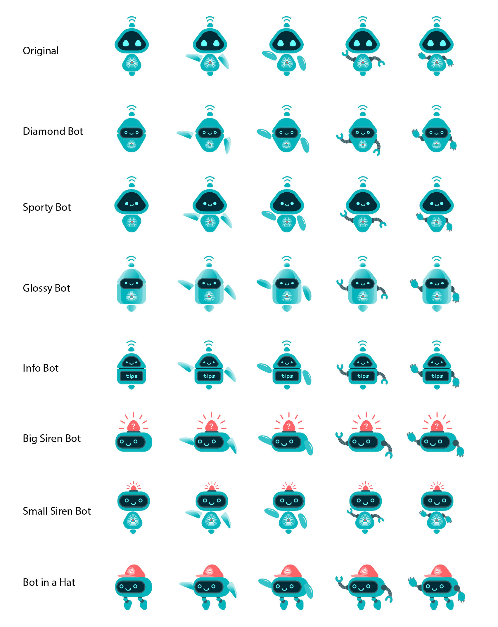
Through multiple explorations and quick stakeholder tests, everyone aligned on keeping the simpler version of the robot design, but add expression and emotion via motion design in the later stage.
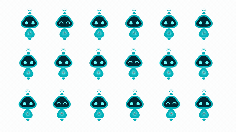
1. After few rounds we decided to remove hands for simplicity
2. Retained the original head but added dimentionality to the head and body
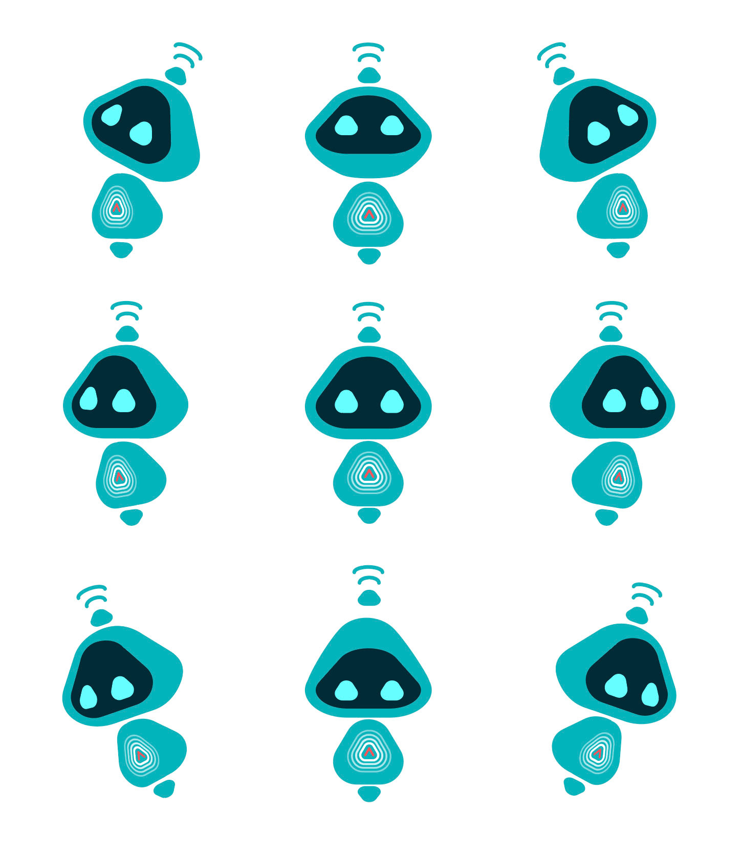
thickness was added to the head and body to give a sense of 3D depth when the robot turn
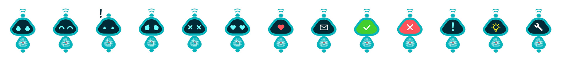
3. Expanded facial expressions to convey emotion and context (via the screen face)
2. Building the Animation Library
I developed an extensive library of animated states and transitions, covering emotions, actions, and festive moments, designed for reusability across departments.
Animations followed the principles of “constant life”: even idle states had micro-motion and bounce to feel alive.
3. Product Integration
The animated mascot became the face of the product tour, turning a static experience into one filled with warmth and charm.
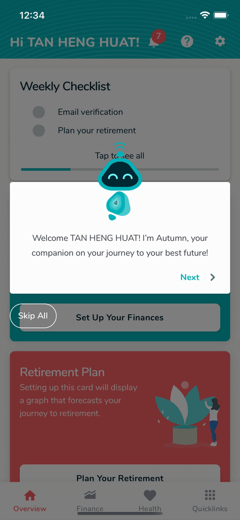
Product Tour - Before
There was no transitions and micro interactions, no animation. Product tour felt like a cold and static draft.
There was no transitions and micro interactions, no animation. Product tour felt like a cold and static draft.
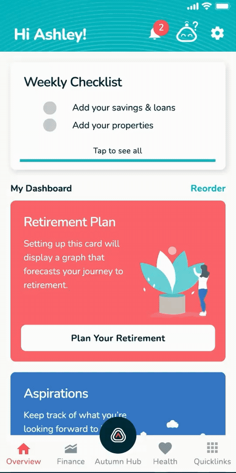
Product Tour - After
Added micro interaction, transitions, and animation
Added micro interaction, transitions, and animation
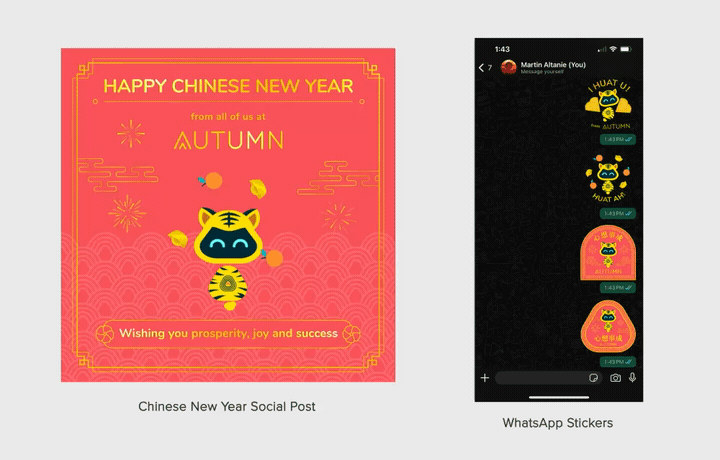
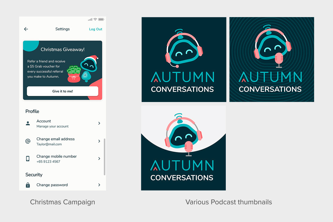
4. Marketing Expansion
The mascot evolved into a shared design asset across teams — featured in festive greetings, social media, WhatsApp stickers, and the company podcast.
This not only strengthened Autumn’s brand personality but created a cohesive identity across all touchpoints.
🌟 Outcome & Impact
Impact highlights:
- Unified product and marketing through a shared mascot system.
- Humanized the app experience, adding personality to serious financial topics.
- Created a scalable animation library adopted across departments.
- Helped build brand recall in a competitive fintech market.
- Unified product and marketing through a shared mascot system.
- Humanized the app experience, adding personality to serious financial topics.
- Created a scalable animation library adopted across departments.
- Helped build brand recall in a competitive fintech market.
🪞Reflection
This project deepened my understanding of how motion can shape brand perception and usability within digital products.
What I learned:
- Hidden value of motion: Sometimes adding motion and micro interaction have the bigger emotional impact vs adding layer of design complication.
- Design systems aren’t just static: A modular animation system can scale visual language as powerfully as a component library.
- Cross-functional empathy: Building a system used by both product and marketing taught me to anticipate technical constraints and brand needs simultaneously.
- Strategic alignment: Beyond aesthetics, the mascot became a tool for engagement, a reminder that design decisions can drive measurable user delight and retention.